Related Plugins and Tags

QGIS Planet

Movement data in GIS #10: open tools for AIS tracks from MarineCadastre.gov

MarineCadastre.gov is a great source for AIS data along the US coast. Their data formats and tools though are less open. Luckily, GDAL – and therefore QGIS – can read ESRI File Geodatabases (.gdb).

MarineCadastre.gov also offer a Track Builder script that creates lines out of the broadcast points. (It can also join additional information from the vessel and voyage layers.) We could reproduce the line creation step using tools such as Processing’s Point to path but this post will show how to create PostGIS trajectories instead.

First, we have to import the points into PostGIS using either DB Manager or Processing’s Import into PostGIS tool:

Then we can create the trajectories. I’ve opted to create a materialized view:

The first part of the query creates a temporary table called ptm (short for PointM). This step adds time stamp information to each point. The second part of the query then aggregates these PointMs into trajectories of type LineStringM.

CREATE MATERIALIZED VIEW ais.trajectory AS
 WITH ptm AS (
   SELECT b.mmsi,
     st_makepointm(
       st_x(b.geom), 
       st_y(b.geom), 
       date_part('epoch', b.basedatetime)
     ) AS pt,
     b.basedatetime t
   FROM ais.broadcast b
   ORDER BY mmsi, basedatetime
 )
 SELECT row_number() OVER () AS id,
   st_makeline(ptm.pt) AS st_makeline,
   ptm.mmsi,
   min(ptm.t) AS min_t,
   max(ptm.t) AS max_t
 FROM ptm
 GROUP BY ptm.mmsi
WITH DATA;

The trajectory start and end times (min_t and max_t) are optional but they can help speed up future queries.

One of the advantages of creating trajectory lines is that they render many times faster than the original points.

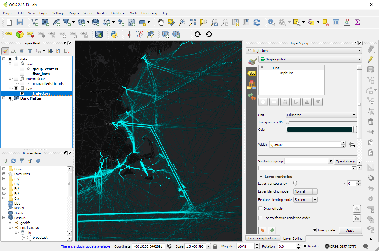
Of course, we end up with some artifacts at the border of the dataset extent. (Files are split by UTM zone.) Trajectories connect the last known position before the vessel left the observed area with the position of reentry. This results, for example, in vertical lines which you can see in the bottom left corner of the above screenshot.

With the trajectories ready, we can go ahead and start exploring the dataset. For example, we can visualize trajectory speed and/or create animations:

Purple trajectory segments are slow while green segments are faster

We can also perform trajectory analysis, such as trajectory generalization:

This is a first proof of concept. It would be great to have a script that automatically fetches the datasets for a specified time frame and list of UTM zones and loads them into PostGIS for further processing. In addition, it would be great to also make use of the information in the vessel and voyage tables, thus splitting up trajectories into individual voyages.


Read more:

Movement data in GIS #9: trajectory data models

There are multiple ways to model trajectory data. This post takes a closer look at the OGC® Moving Features Encoding Extension: Simple Comma Separated Values (CSV). This standard has been published in 2015 but I haven’t been able to find any reviews of the standard (in a GIS context or anywhere else).

The following analysis is based on the official OGC trajcectory example at http://docs.opengeospatial.org/is/14-084r2/14-084r2.html#42. The header consists of two lines: the first line provides some meta information while the second defines the CSV columns. The data model is segment based. That is, each line describes a trajectory segment with at least two coordinate pairs (or triplets for 3D trajectories). For each segment, there is a start and an end time which can be specified as absolute or relative (offset) values:

@stboundedby,urn:x-ogc:def:crs:EPSG:6.6:4326,2D,50.23 9.23,50.31 9.27,2012-01-17T12:33:41Z,2012-01-17T12:37:00Z,sec
@columns,mfidref,trajectory,state,xsd:token,”type code”,xsd:integer
a, 10,150,11.0 2.0 12.0 3.0,walking,1
b, 10,190,10.0 2.0 11.0 3.0,walking,2
a,150,190,12.0 3.0 10.0 3.0,walking,2
c, 10,190,12.0 1.0 10.0 2.0 11.0 3.0,vehicle,1

Let’s look at the first data row in detail:

  • a … trajectory id
  • 10 … start time offset from 2012-01-17T12:33:41Z in seconds
  • 150 … end time offset from 2012-01-17T12:33:41Z in seconds
  • 11.0 2.0 12.0 3.0 … trajectory coordinates: x1, y1, x2, y2
  • walking …  state
  • 1… type code

My main issues with this approach are

  1. They missed the chance to use WKT notation to make the CSV easily readable by existing GIS tools.
  2. As far as I can see, the data model requires a regular sampling interval because there is no way to store time stamps for intermediate positions along trajectory segments. (Irregular intervals can be stored using segments for each pair of consecutive locations.)

In the common GIS simple feature data model (which is point-based), the same data would look something like this:

traj_id,x,y,t,state,type_code
a,11.0,2.0,2012-01-17T12:33:51Z,walking,1
a,12.0,3.0,2012-01-17T12:36:11Z,walking,1
a,10.0,3.0,2012-01-17T12:36:51Z,walking,2
b,10.0,2.0,2012-01-17T12:33:51Z,walking,2
b,11.0,3.0,2012-01-17T12:36:51Z,walking,2
c,12.0,1.0,2012-01-17T12:33:51Z,vehicle,1
c,10.0,2.0,2012-01-17T12:35:21Z,vehicle,1
c,11.0,3.0,2012-01-17T12:36:51Z,vehicle,1

The main issue here is that there has to be some application logic that knows how to translate from points to trajectory. For example, trajectory a changes from walking1 to walking2 at 2012-01-17T12:36:11Z but we have to decide whether to store the previous or the following state code for this individual point.

An alternative to the common simple feature model is the PostGIS trajectory data model (which is LineStringM-based). For this data model, we need to convert time stamps to numeric values, e.g. 2012-01-17T12:33:41Z is 1326803621 in Unix time. In this data model, the data looks like this:

traj_id,trajectory,state,type_code
a,LINESTRINGM(11.0 2.0 1326803631, 12.0 3.0 1326803771),walking,1
a,LINESTRINGM(12.0 3.0 1326803771, 10.0 3.0 1326803811),walking,2
b,LINESTRINGM(10.0 2.0 1326803631, 11.0 3.0 1326803811),walking,2
c,LINESTRINGM(12.0 1.0 1326803631, 10.0 2.0 1326803771, 11.0 3.0 1326803811),vehicle,1

This is very similar to the OGC data model, with the notable difference that every position is time-stamped (instead of just having segment start and end times). If one has movement data which is recorded at regular intervals, the OGC data model can be a bit more compact, but if the trajectories are sampled at irregular intervals, each point pair will have to be modeled as a separate segment.

Since the PostGIS data model is flexible, explicit, and comes with existing GIS tool support, it’s my clear favorite.


Read more:

Movement data in GIS extra: trajectory generalization code and sample data

Today’s post is a follow-up of Movement data in GIS #3: visualizing massive trajectory datasets. In that post, I summarized a concept for trajectory generalization. Now, I have published the scripts and sample data in my QGIS-Processing-tools repository on Github.

To add the trajectory generalization scripts to your Processing toolbox, you can use the Add scripts from files tool:

It is worth noting, that Add scripts from files fails to correctly import potential help files for the scripts but that’s not an issue this time around, since I haven’t gotten around to actually write help files yet.

The scripts are used in the following order:

  1. Extract characteristic trajectory points
  2. Group points in space
  3. Compute flows between cells from trajectories

The sample project contains input data, as well as output layers of the individual tools. The only required input is a layer of trajectories, where trajectories have to be LINESTRINGM (note the M!) features:

Trajectory sample based on data provided by the GeoLife project

In Extract characteristic trajectory points, distance parameters are specified in meters, stop duration in seconds, and angles in degrees. The characteristic points contain start and end locations, as well as turns and stop locations:

The characteristic points are then clustered. In this tool, the distance has to be specified in layer units, which are degrees in case of the sample data.

Finally, we can compute flows between cells defined by these clusters:

Flow lines scaled by flow strength and cell centers scaled by counts

If you use these tools on your own data, I’d be happy so see what you come up with!


Read more:

Movement data in GIS #7: animated trajectories with TimeManager

In this post, we use TimeManager to visualize the position of a moving object over time along a trajectory. This is another example of what is possible thanks to QGIS’ geometry generator feature. The result can look like this:

What makes this approach interesting is that the trajectory is stored in PostGIS as a LinestringM instead of storing individual trajectory points. So there is only one line feature loaded in QGIS:

(In part 2 of this series, we already saw how a geometry generator can be used to visualize speed along a trajectory.)

The layer is added to TimeManager using t_start and t_end attributes to define the trajectory’s temporal extent.

TimeManager exposes an animation_datetime() function which returns the current animation timestamp, that is, the timestamp that is also displayed in the TimeManager dock, as well as on the map (if we don’t explicitly disable this option).

Once TimeManager is set up, we can edit the line style to add a point marker to visualize the position of the moving object at the current animation timestamp. To do that, we interpolate the position along the trajectory segments. The first geometry generator expression splits the trajectory in its segments:

The second geometry generator expression interpolates the position on the segment that contains the current TimeManager animation time:

The WHEN statement compares the trajectory segment’s start and end times to the current TimeManager animation time. Afterwards, the line_interpolate_point function is used to draw the point marker at the correct position along the segment:

CASE 
WHEN (
m(end_point(geometry_n($geometry,@geometry_part_num)))
> second(age(animation_datetime(),to_datetime('1970-01-01 00:00')))
AND
m(start_point(geometry_n($geometry,@geometry_part_num)))
<= second(age(animation_datetime(),to_datetime('1970-01-01 00:00')))
)
THEN
line_interpolate_point( 
  geometry_n($geometry,@geometry_part_num),
  1.0 * (
    second(age(animation_datetime(),to_datetime('1970-01-01 00:00')))
	- m(start_point(geometry_n($geometry,@geometry_part_num)))
  ) / (
    m(end_point(geometry_n($geometry,@geometry_part_num)))
	- m(start_point(geometry_n($geometry,@geometry_part_num)))
  ) 
  * length(geometry_n($geometry,@geometry_part_num))
)
END

Here is the animation result for a part of the trajectory between 08:00 and 09:00:


Read more:


Movement data in GIS #5: current research topics

In the 1st part of this series, I mentioned the Workshop on Analysis of Movement Data at the GIScience 2016 conference. Since the workshop took place in September 2016, 11 abstracts have been published (the website seems to be down currently, see the cached version) covering topics from general concepts for movement data analysis, to transport, health, and ecology specific articles. Here’s a quick overview of what researchers are currently working on:

  • General topics
    • Interpolating trajectories with gaps in the GPS signal while taking into account the context of the gap [Hwang et al., 2016]
    • Adding time and weather context to understand their impact on origin-destination flows [Sila-Nowicka and Fotheringham, 2016]
    • Finding optimal locations for multiple moving objects to meet and still arrive at their destination in time [Gao and Zeng, 2016]
    • Modeling checkpoint-based movement data as sequence of transitions [Tao, 2016]
  • Transport domain
    • Estimating junction locations and traffic regulations using extended floating car data [Kuntzsch et al., 2016]
  • Health domain
    • Clarifying physical activity domain semantics using ontology design patterns [Sinha and Howe, 2016]
    • Recognizing activities based on Pebble Watch sensors and context for eight gestures, including brushing one’s teeth and combing one’s hair [Cherian et al., 2016]
    • Comparing GPS-based indicators of spatial activity with reported data [Fillekes et al., 2016]
  • Ecology domain
    • Linking bird movement with environmental context [Bohrer et al., 2016]
    • Quantifying interaction probabilities for moving and stationary objects using probabilistic space-time prisms [Loraamm et al., 2016]
    • Generating probability density surfaces using time-geographic density estimation [Downs and Hyzer, 2016]

If you are interested in movement data in the context of ecological research, don’t miss the workshop on spatio-temporal analysis, modelling and data visualisation for movement ecology at the Lorentz Center in Leiden in the Netherlands. There’s currently a call for applications for young researchers who want to attend this workshop.

Since I’m mostly working with human and vehicle movement data in outdoor settings, it is interesting to see the bigger picture of movement data analysis in GIScience. It is worth noting that the published texts are only abstracts, therefore there is not much detail about algorithms and whether the code will be available as open source.

For more reading: full papers of the previous workshop in 2014 have been published in the Int. Journal of Geographical Information Science, vol 30(5). More special issues on “Computational Movement Analysis” and “Representation and Analytical Models for Location-based Social Media Data and Tracking Data” have been announced.

References

[Bohrer et al., 2016] Bohrer, G., Davidson, S. C., Mcclain, K. M., Friedemann, G., Weinzierl, R., and Wikelski, M. (2016). Contextual Movement Data of Bird Flight – Direct Observations and Annotation from Remote Sensing.
[Cherian et al., 2016] Cherian, J., Goldberg, D., and Hammond, T. (2016). Sensing Day-to-Day Activities through Wearable Sensors and AI.
[Downs and Hyzer, 2016] Downs, J. A. and Hyzer, G. (2016). Spatial Uncertainty in Animal Tracking Data: Are We Throwing Away Useful Information?
[Fillekes et al., 2016] Fillekes, M., Bereuter, P. S., and Weibel, R. (2016). Comparing GPS-based Indicators of Spatial Activity to the Life-Space Questionnaire (LSQ) in Research on Health and Aging.
[Gao and Zeng, 2016] Gao, S. and Zeng, Y. (2016). Where to Meet: A Context-Based Geoprocessing Framework to Find Optimal Spatiotemporal Interaction Corridor for Multiple Moving Objects.
[Hwang et al., 2016] Hwang, S., Yalla, S., and Crews, R. (2016). Conditional resampling for segmenting GPS trajectory towards exposure assessment.
[Kuntzsch et al., 2016] Kuntzsch, C., Zourlidou, S., and Feuerhake, U. (2016). Learning the Traffic Regulation Context of Intersections from Speed Profile Data.
[Loraamm et al., 2016] Loraamm, R. W., Downs, J. A., and Lamb, D. (2016). A Time-Geographic Approach to Wildlife-Road Interactions.
[Sila-Nowicka and Fotheringham, 2016] Sila-Nowicka, K. and Fotheringham, A. (2016). A route map to calibrate spatial interaction models from GPS movement data.
[Sinha and Howe, 2016] Sinha, G. and Howe, C. (2016). An Ontology Design Pattern for Semantic Modelling of Children’s Physical Activities in School Playgrounds.
[Tao, 2016] Tao, Y. (2016). Data Modeling for Checkpoint-based Movement Data.


Movement data in GIS #4: variations over time

In the previous post, I presented an approach to generalize big trajectory datasets by extracting flows between cells of a data-driven irregular grid. This generalization provides a much better overview of the flow and directionality than a simple plot of the original raw trajectory data can. The paper introducing this method also contains more advanced visualizations that show cell statistics, such as the overall count of trajectories or the generalization quality. Another bit of information that is often of interest when exploring movement data, is the time of the movement. For example, at LBS2016 last week, M. Jahnke presented an application that allows users to explore the number of taxi pickups and dropoffs at certain locations:

By adopting this approach for the generalized flow maps, we can, for example, explore which parts of the research area are busy at which time of the day. Here I have divided the day into four quarters: night from 0 to 6 (light blue), morning from 6 to 12 (orange), afternoon from 12 to 18 (red), and evening from 18 to 24 (dark blue).

 (data credits: GeoLife project,

Aggregated trajectories with time-of-day markers at flow network nodes (data credits: GeoLife project, map tiles: Carto, map data: OSM)

The resulting visualization shows that overall, there is less movement during the night hours from midnight to 6 in the morning (light blue quarter). Sounds reasonable!

One implementation detail worth considering is which timestamp should be used for counting the number of movements. Should it be the time of the first trajectory point entering a cell, or the time when the trajectory leaves the cell, or some average value? In the current implementation, I have opted for the entry time. This means that if the tracked person spends a long time within a cell (e.g. at the work location) the trip home only adds to the evening trip count of the neighboring cell along the trajectory.

Since the time information stored in a PostGIS LinestringM feature’s m-value does not contain any time zone information, we also have to pay attention to handle any necessary offsets. For example, the GeoLife documentation states that all timestamps are provided in GMT while Beijing is in the GMT+8 time zone. This offset has to be accounted for in the analysis script, otherwise the counts per time of day will be all over the place.

Using the same approach, we could also investigate other variations, e.g. over different days of the week, seasonal variations, or the development over multiple years.


Movement data in GIS #3: visualizing massive trajectory datasets

In the fist two parts of the Movement Data in GIS series, I discussed modeling trajectories as LinestringM features in PostGIS to overcome some common issues of movement data in GIS and presented a way to efficiently render speed changes along a trajectory in QGIS without having to split the trajectory into shorter segments.

While visualizing individual trajectories is important, the real challenge is trying to visualize massive trajectory datasets in a way that enables further analysis. The out-of-the-box functionality of GIS is painfully limited. Except for some transparency and heatmap approaches, there is not much that can be done to help interpret “hairballs” of trajectories. Luckily researchers in visual analytics have already put considerable effort into finding solutions for this visualization challenge. The approach I want to talk about today is by Andrienko, N., & Andrienko, G. (2011). Spatial generalization and aggregation of massive movement data. IEEE Transactions on visualization and computer graphics, 17(2), 205-219. and consists of the following main steps:

  1. Extracting characteristic points from the trajectories
  2. Grouping the extracted points by spatial proximity
  3. Computing group centroids and corresponding Voronoi cells
  4. Deviding trajectories into segments according to the Voronoi cells
  5. Counting transitions from one cell to another

The authors do a great job at describing the concepts and algorithms, which made it relatively straightforward to implement them in QGIS Processing. So far, I’ve implemented the basic logic but the paper contains further suggestions for improvements. This was also my first pyQGIS project that makes use of the measurement value support in the new geometry engine. The time information stored in the m-values is used to detect stop points, which – together with start, end, and turning points – make up the characteristic points of a trajectory.

The following animation illustrates the current state of the implementation: First the “hairball” of trajectories is rendered. Then we extract the characteristic points and group them by proximity. The big black dots are the resulting group centroids. From there, I skipped the Voronoi cells and directly counted transitions from “nearest to centroid A” to “nearest to centroid B”.

(data credits: GeoLife project)

From thousands of individual trajectories to a generalized representation of overall movement patterns (data credits: GeoLife project, map tiles: Stamen, map data: OSM)

The resulting visualization makes it possible to analyze flow strength as well as directionality. I have deliberately excluded all connections with a count below 10 transitions to reduce visual clutter. The cell size / distance between point groups – and therefore the level-of-detail – is one of the input parameters. In my example, I used a target cell size of approximately 2km. This setting results in connections which follow the major roads outside the city center very well. In the city center, where the road grid is tighter, trajectories on different roads mix and the connections are less clear.

Since trajectories in this dataset are not limited to car trips, it is expected to find additional movement that is not restricted to the road network. This is particularly noticeable in the dense area in the west where many slow trajectories – most likely from walking trips – are located. The paper also covers how to ensure that connections are limited to neighboring cells by densifying the trajectories before computing step 4.

trajectory_generalization

Running the scripts for over 18,000 trajectories requires patience. It would be worth evaluating if the first three steps can be run with only a subsample of the data without impacting the results in a negative way.

One thing I’m not satisfied with yet is the way to specify the target cell size. While it’s possible to measure ellipsoidal distances in meters using QgsDistanceArea (irrespective of the trajectory layer’s CRS), the initial regular grid used in step 2 in order to group the extracted points has to be specified in the trajectory layer’s CRS units – quite likely degrees. Instead, it may be best to transform everything into an equidistant projection before running any calculations.

It’s good to see that PyQGIS enables us to use the information encoded in PostGIS LinestringM features to perform spatio-temporal analysis. However, working with m or z values involves a lot of v2 geometry classes which work slightly differently than their v1 counterparts. It certainly takes some getting used to. This situation might get cleaned up as part of the QGIS 3 API refactoring effort. If you can, please support work on QGIS 3. Now is the time to shape the PyQGIS API for the following years!


  • <<
  • Page 3 of 3 ( 47 posts )
  • movement data

Back to Top

Sustaining Members